I am so excited it’s hard to breathe. I’ve been working with a friend of a friend–an incredible freelancer named Hollie Williams–who blew me away today. She sent me the final press file for my one sheet.
What in the world is a one sheet?
To put it simply, it’s a one page advertisement for your book and for you, the author. In the publishing realm, there are daunting moments when we aspiring authors get the opportunity to speak face to face with agents, editors and publishers at writers conferences. The one sheet is what we leave with the sage when we walk away, (if all went well).
It’s conference season, so loads of writers across the nation are preparing their pitches and one sheets for those meetings.
Here’s how you use the one-sheet. At appointments, or when you mercifully catch the ear of a gracious agent/editor/publisher elsewhere, you throw out your elevator pitch (a 35-word-or-less teaser to convey just enough of the plot that they crave more). If an agent expresses interest in your book, you hand them your one sheet as you answer their questions and reveal a little more. If the light of heaven shines down on you (Can you hear the angel choir imitation I’m doing?) and you are invited to submit the proposal or the first three chapters, you say a grateful thank you. Then, try not to dance right in front of them and leave the one sheet with them. Ideally, it makes you stand out. Sure, dancing would make you memorable, too, but don’t go there.
The one sheet usually contains your elevator pitch, the blurb (think back-cover copy), and a brief, relevant bio (don’t tell them you are the head of the PTA unless your main character is–you know–also the head of the PTA).
One sheets can also be used by your agent when they pitch your book to editors and publishing houses, so the effort can be extremely worthwhile. Don’t assume your agent will use your one sheet, though, as most agents have their own system. Still, it never hurts to have a product so well done that an agent can thank you for making their life easier. After all, much of the marketing process is ours to handle as authors. We’ve got to be out there, winning the attention of future readers.
That’s what I’m after.
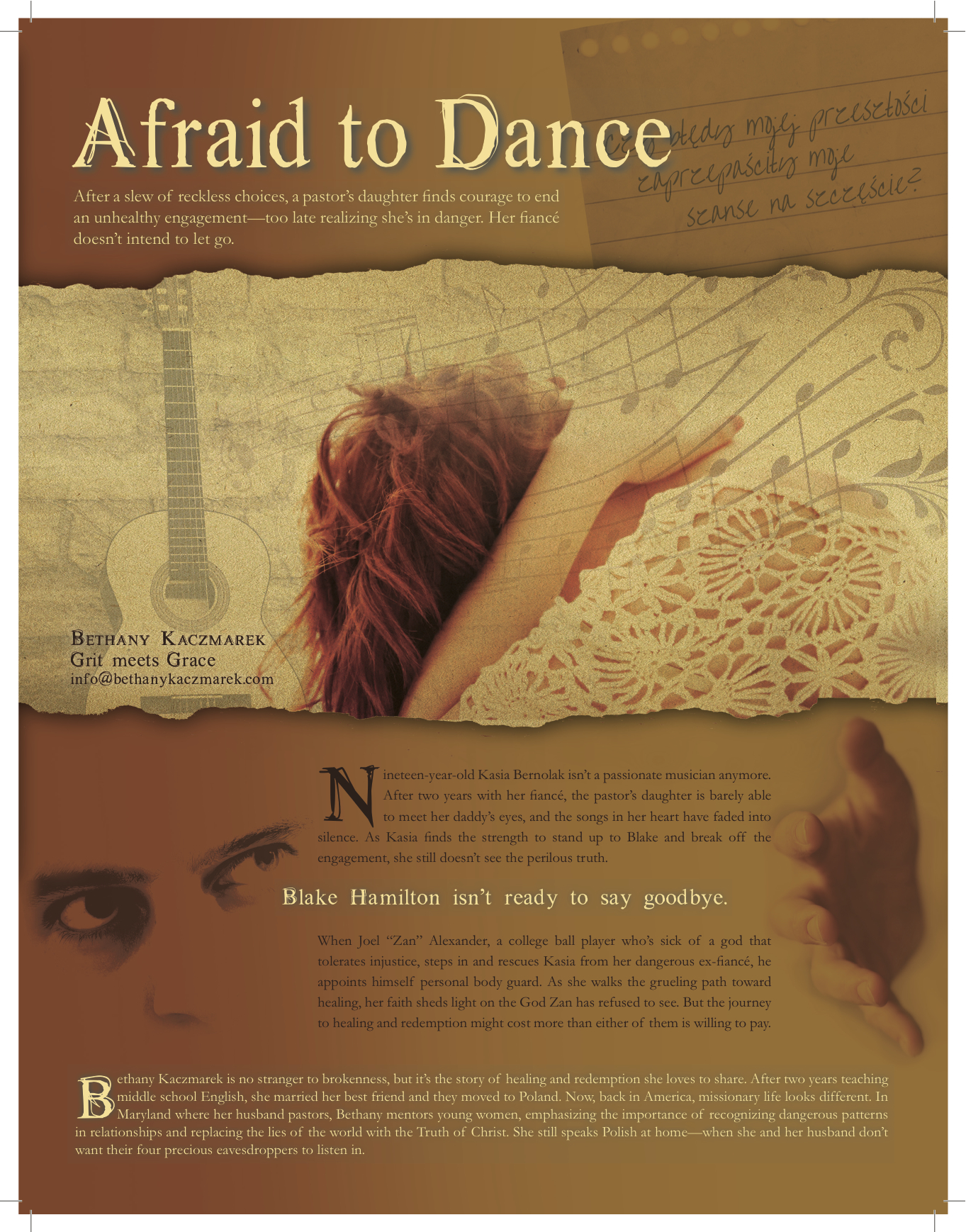
I needed my one sheet to sing, because my main character Kasia Bernolak does. My blurb was tight and clear, but I wanted to convey the tone of the book through images. My problem: how do I weave those in seamlessly enough to not make the one sheet cluttered and clunky? Enter: Hollie Williams. This woman is a graphic design wizard. And the best part? As we began talking about the book, she asked to read the proposal and several of the key scenes, so she would personally have a handle on the themes and mood. That alone made me trust her. But there’s more. Throughout the process, my girl asked questions and sought feedback. It was fresh and interactive. The result?
All I can say is wow.
Mission: Accomplished. I’m framing this baby and hanging it on my office wall. (Yeah, I’ll leave room for future one sheets and book covers).
I’d be honored if you’d take a look. Tell me, what can you tell about my character that isn’t written in the blurb?


I love your one-sheet, too, Bethany! Superb.
Thank you, Emily. Didn’t Hollie do phenomenal work?
Love it. The page is beautiful and does a great job “teasing”. Makes me want to grab the book.
Thanks! I hope you get the chance to do that one day. 🙂
Beautiful! Hollie did a great job. I love how the sheet blends with just enough of a teaser to show Kasia as a gentle, loving woman. One is who is concerned about her savior’s need of the Savior. Can’t wait to read the book!
She truly nailed it, Tammie. Thanks for sharing your thoughts.
She must be Polish 🙂
I can’t wait to read it. Thanks for sharing!
Yep! Good call. That’s a page from her journal in the upper right corner. It says, “Will my past mistakes ruin my chance to have a meaningful future?” Thanks for stopping by.
Absolutely beautiful! And it certainly has the hook to make me want to read the book! I really like the picture, too-to me it’s almost like she has an inkling of the truth, but she is too afraid to see it. I wish you much success, Bethany!
Thanks, Rebecca. You got exactly what I wanted you to…which makes me want to hug Hollie Williams. Again.
Just wow. That’s incredible — the one sheet AND the story! I’m hooked and will be watching for it in print one day!
Yay! Now if I could just find an agent. 🙂 (Actually I’m currently waiting for a response from an agent). Here’s hoping!
This is an awesome One-Pager, Bethany! I wish I could do this.
As a first-time conference attendee, I’ve been contemplating how to create an attractive One-Pager on dial up. It’s hard to get into the sites with graphics, and download them. So I’m searching through MS Word’s clip art. Trouble is I can’t find a Victorian House that exemplifies what I want.
My concern is an agent will turn me down because my One-Pager is not as appealing as some. What are your thoughts?
Laurean! Sorry it took me so long to see this. Fret not, my friend!
Don’t let a wowzer one sheet intimidate you (that certainly wasn’t my intention). The story is what matters the most. I know several writers who had extremely simple one sheets and still got requests for the MS. Remember, there are people who do graphic design for a living, but these meeting with agents are about WRITERS and their STORIES. Make an impression yourself, intrigue them with your pitch, have a memorable conversation, and leave the one sheet with them, so they’ll remember YOU. Just make sure there are no typos in it. As long as it looks like you cared enough to do your best on it, you’re set. Believe in yourself and in your story.
I love this Bethany! It looks so good, as someone who has a background in graphic design herself! Could I get this designer’s information in case I’d like to use her for my own one sheet?? If so, thanks. Just PM on facebook. I’m still working on my proposal. Then I need to probably let you edit it. And a one sheet and rep cards. 🙂 I hope to attend perhaps two conferences next year. I hope to use the winter months to get myself organized and ready. 🙂
Anyway, your one sheet is a winner!
Thanks, Danielle! I got all misty when I saw it completed. I’ll absolutely share Hollie’s info with you. What two conferences are you considering next year, because I’m planning to do that, too. It would be fun to get prepared together. You’ll hear from me soon!
Pingback: What's Your Writing Process? - Bethany Kaczmarek | Bethany Kaczmarek